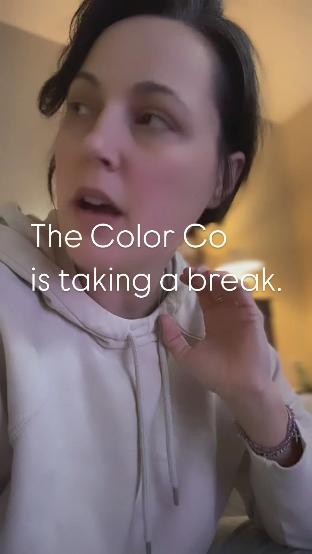

The Color Co
PERSONAL COLOR ANALYSIS
Color is powerful.
Color has the power to shift moods, influence perceptions, convey messages, and create visual impact.
Live authentically, in color.
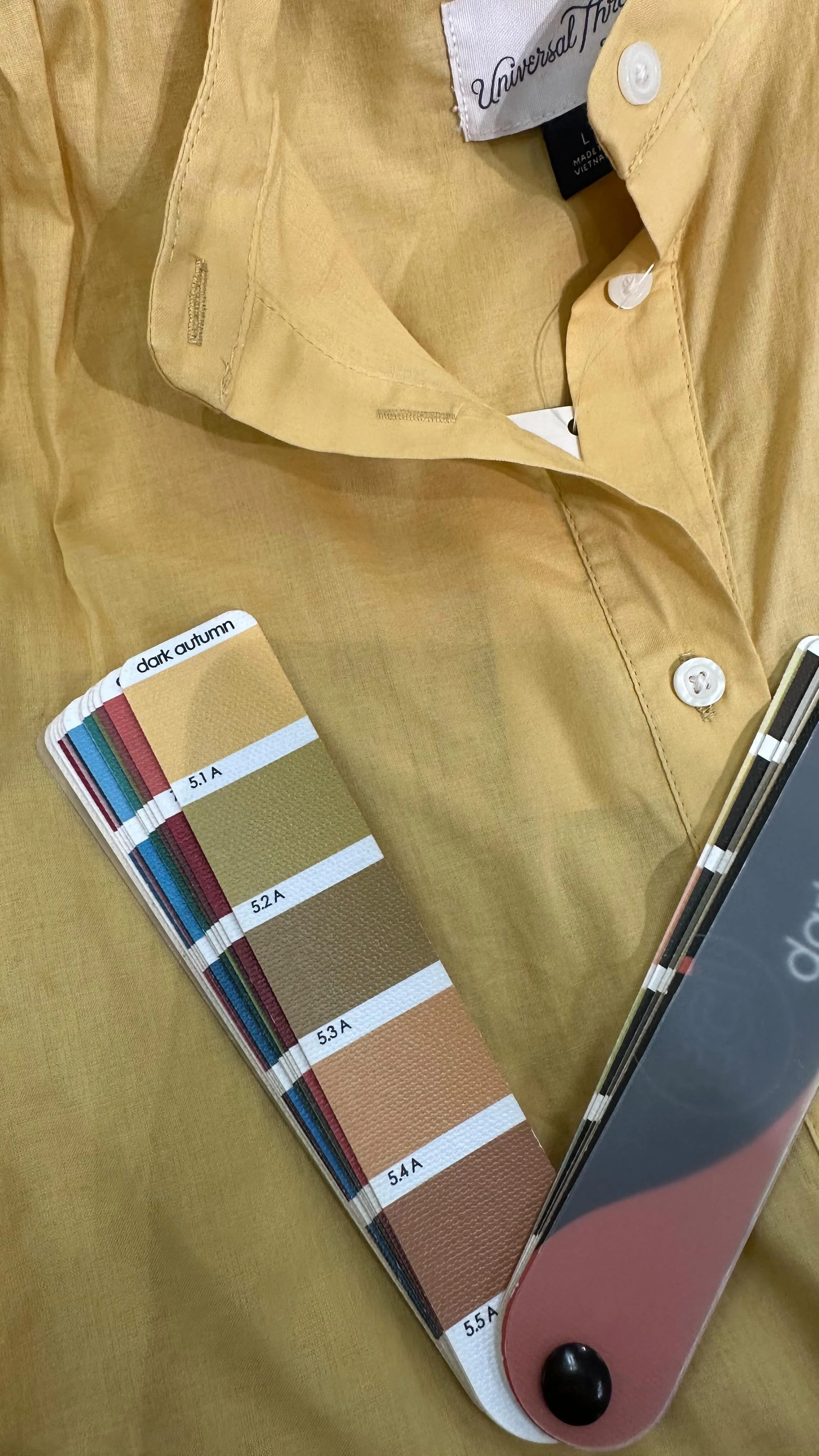
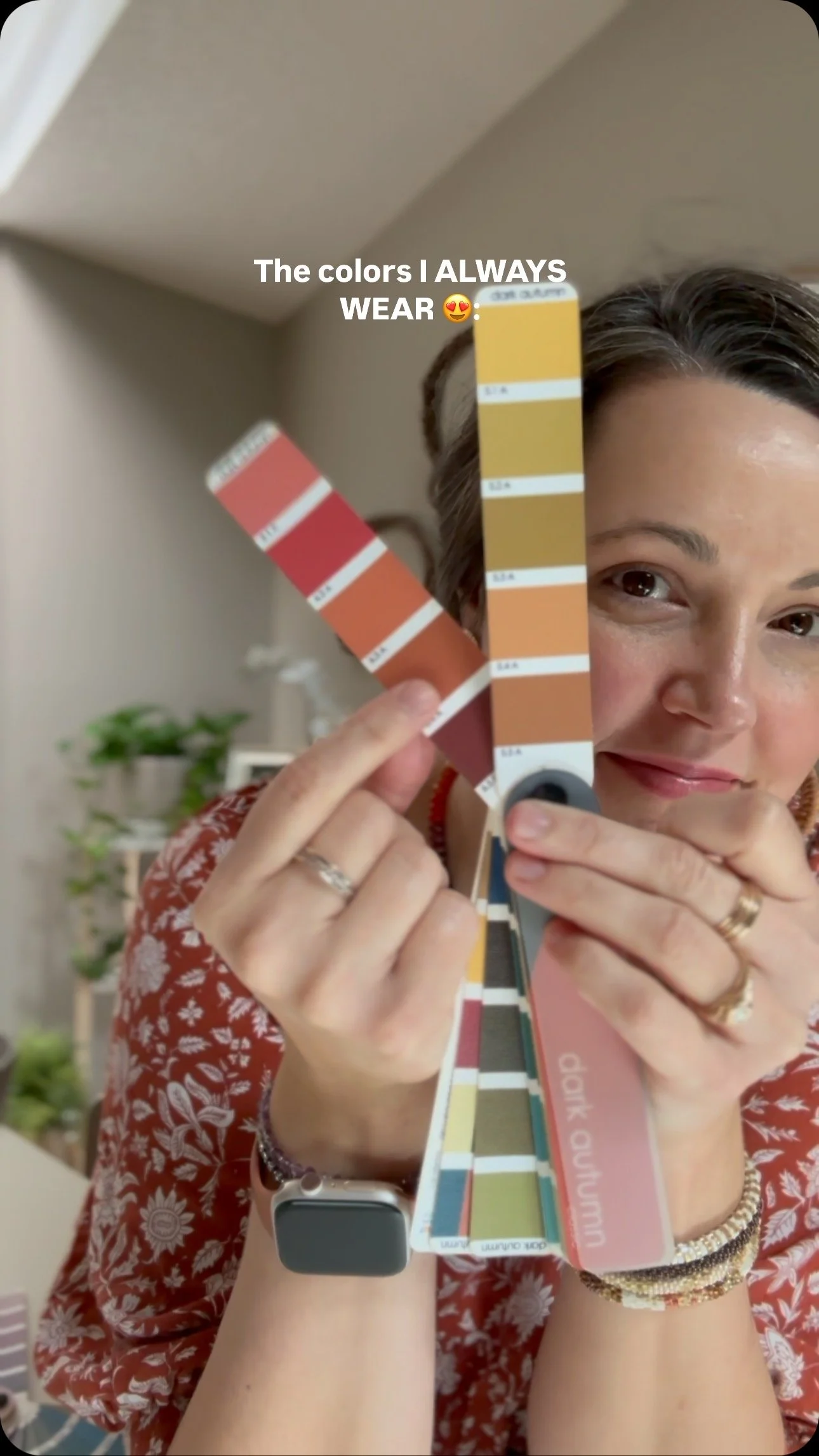
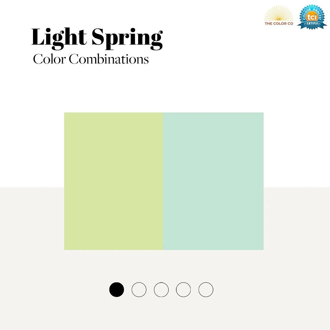
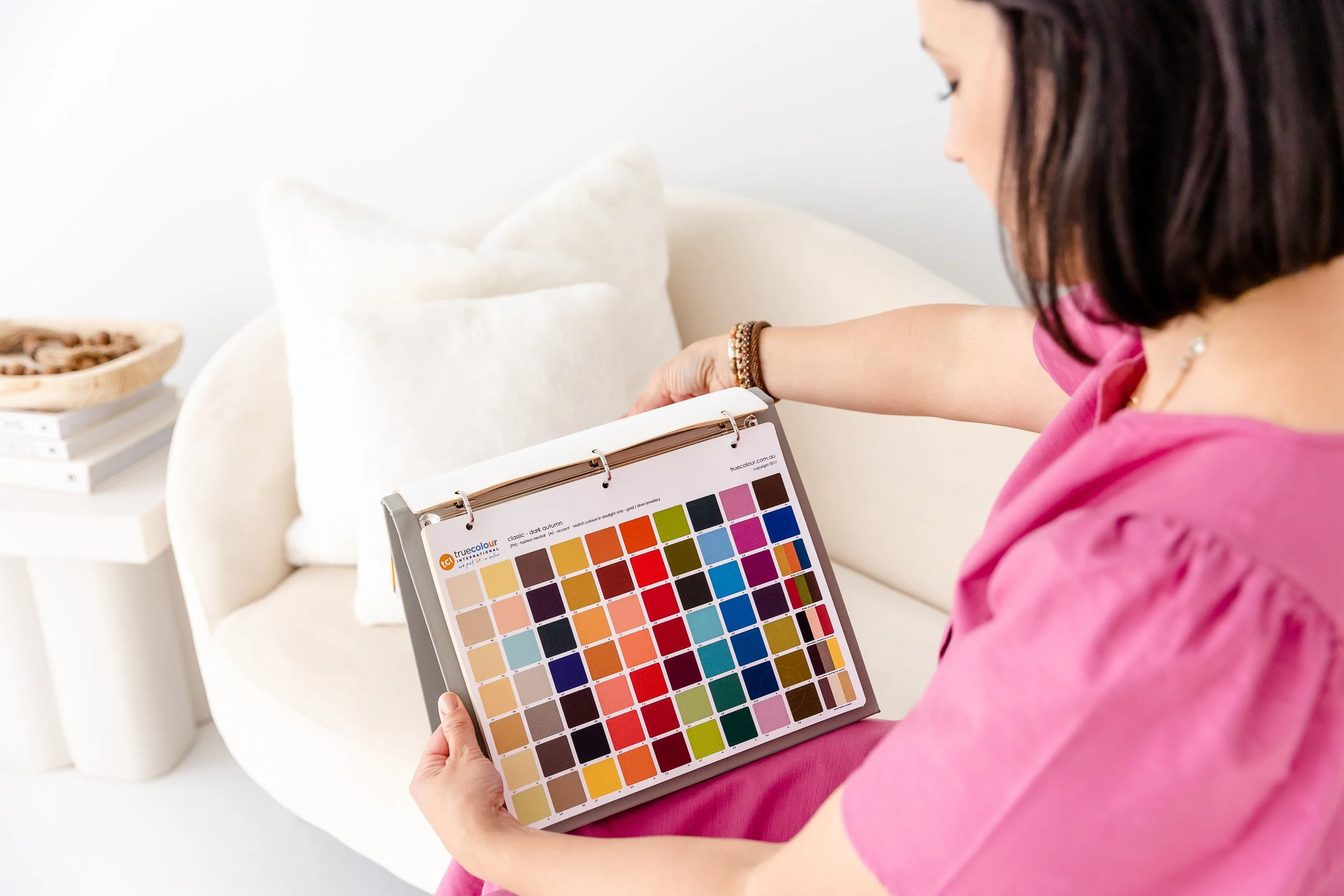
During a personal color analysis you will discover the 65+ colors that are most harmonious with you. Then you will learn how to apply that information to your clothing, make-up, jewelry, and lifestyle.
Let's Connect!
@_thecolorco
Let's Connect! @_thecolorco